Monday 15 December 2014

Reflection


In reflection for the landscape I feel I captured an atmosphere. However, I lost a great deal of edges and shape definition. For the turn around I feel I should have applied much more gesture, as the more I worked on it the more it lost its energy. Therefore, more gesture should be applied. Finally, for the two posed image  I feel like for the aggressive stance I should of captured more emotion with a more sinister
head tilt.

O_O Stages of Landscape


One night I felt like I wanted to work on the composition of my landscape as I didn't like the symmetry in the piece. I was getting happy with how this thumbnail was turning out. So I decided to show it to Ryan. He liked elements of my previous iteration of the thumbnail, How you was higher up looking down. With this thumbnail he felt it was too squashed.


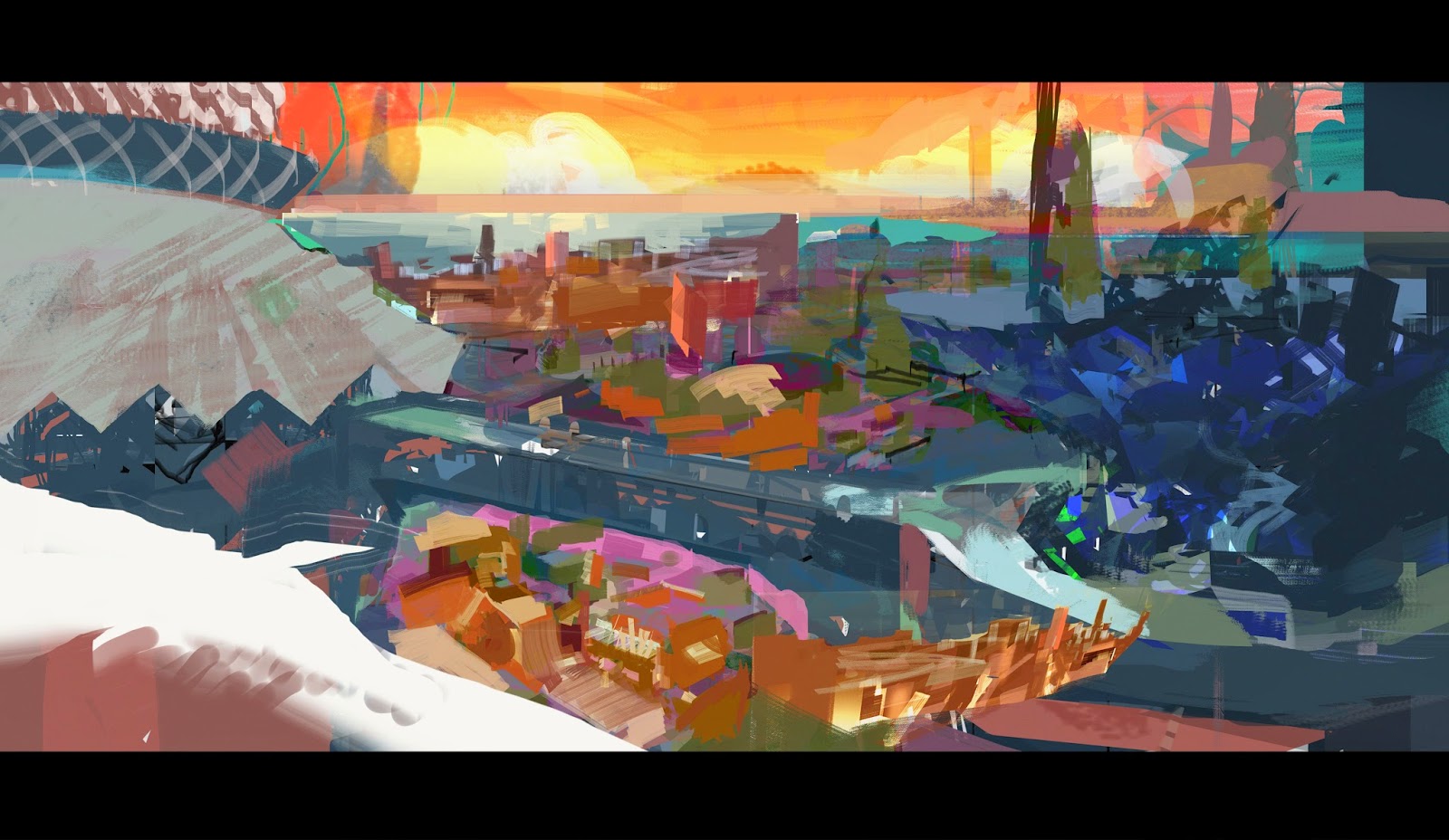
At this stage I widened the shot and allowed more of the city to be seen to give the feeling you were looking down. For the the image I wanted the viewer to feel like take could take a deep breath. What I mean by this is that they could get immersed in the space and travel through the depth of the image.


I felt like I was working in terms of detail too much. So started massing out shapes yet retain elements that suggested the culture/environment.


Here I made the slanted marks to think about the balance in the image.


I've started to cutaway, thought about the perspective and add information.


Pasted in old segments of the painting to give more information.


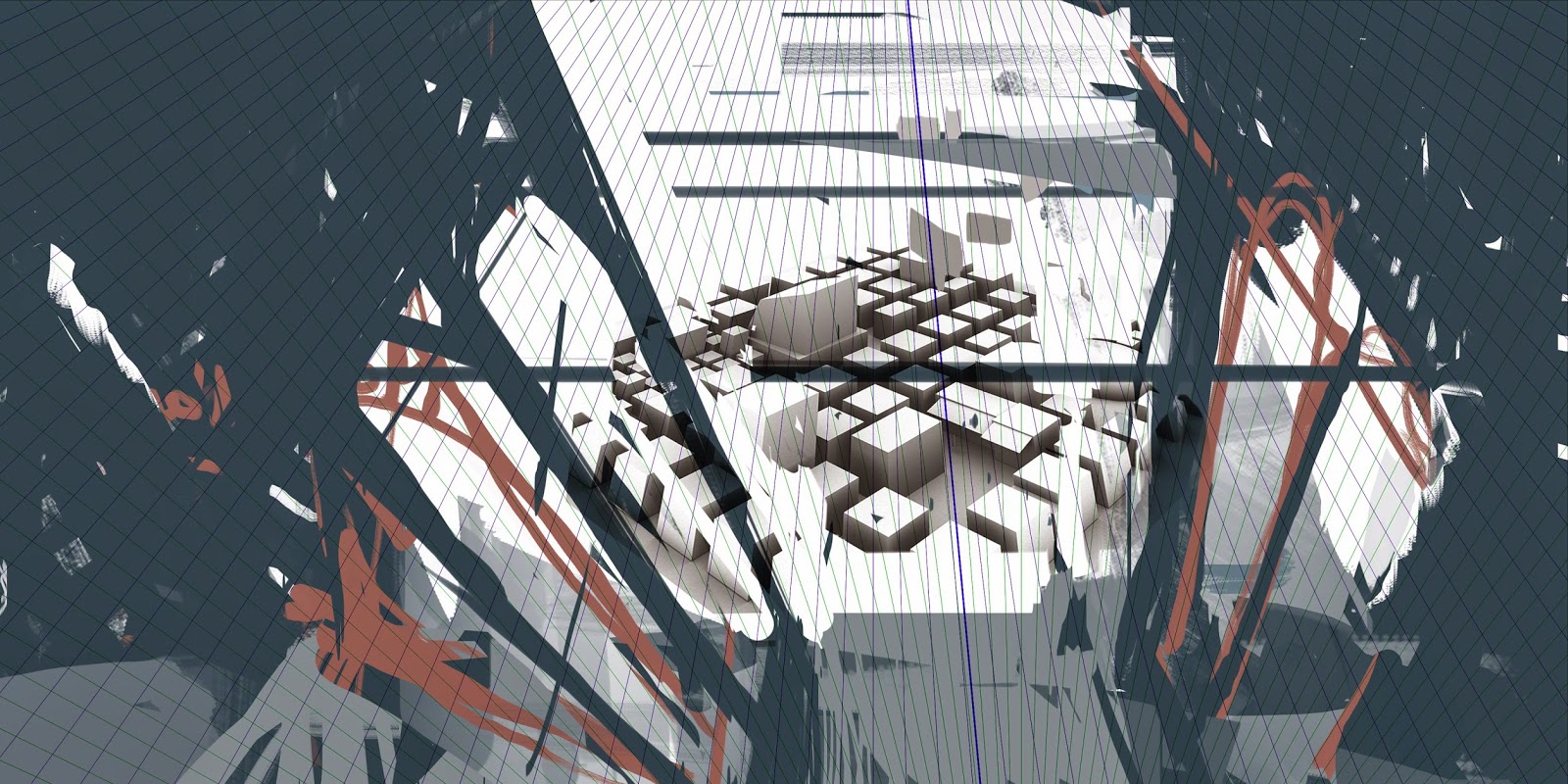
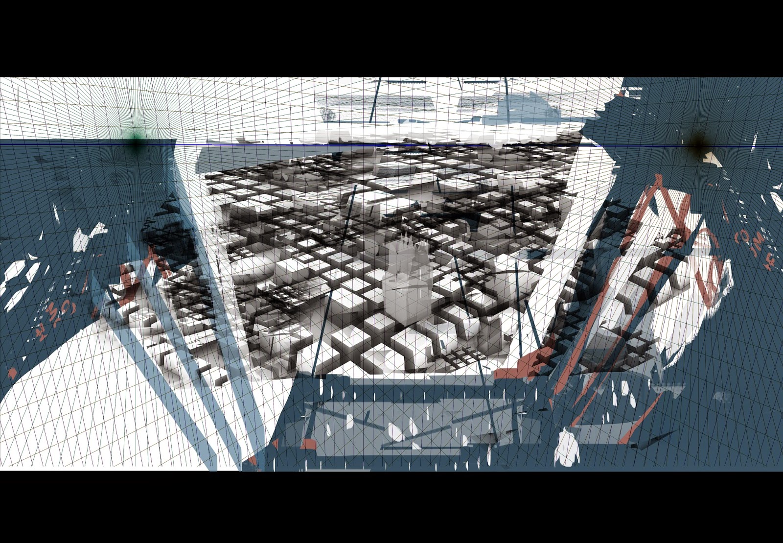
I used the software called carapace made by epic games to figure out the 3-point perspective to get more accurate with the angles.


I like to played withe layer modes and came across the warm washed out look. This appealed to me as it set a time situation and I love the contrast it created.


Grabbed older segments of the painting, that had good shapes and pattern information. I also felt like I wanted more hue variation  to give the feeling that the city is bustling.


I did a pencil line drawing to finalize what everything would look like.


From the line drawing I refined the shapes.


Playing with the form of the plant on the right. adding information in the distance.

Started placing darker shapes to add form to the city.


Working on the sky


It was getting too confused by what was in the city so I did another line drawing. 


Adding contrast to the left to give more focal.


Refining what shapes, adding warmth, boosting saturation on plant.


Refine plant.


Added a road to segment the city to give more space


Added a focal area in the city, adding detail to foreground city space.

working with my drawing to refine structure.

Final.

Exploring possibilities of thumbnail


I liked the feeling of traveling from an interior to the exterior.


I did a rough 3-D model to figure out How wanted the viewers eye to travel through the painting.


I started realizing the perspective was off.


Repeated and and spanned out the 3-D model.


The symmetrical foreground was really appealing to me. So I thought I would play with it. 

Turn around stages


At this stage I have the main value pattern set. So in order to maintain the contrast of each value segment I place colour and run through the layer modes till I find something that sticks true to the values and an interesting hue.

Saturated the colours in relation to the values.


Started mapping out the colours. I didn't like how I designed the interior of the helmet design.


I changed up the helmet to better reflect sun design motifs. I had big trouble trying to transfer the design of butt piece to the back.  I added these front blue pieces of drapery to have some break up in design just having the front metal piece looked boring.  


Here I have refined the back butt piece. Added as blue stripe to the back to add more contrast in the fashion.


Finish.


Stages of the Two angles and poses


I initially sketched these to figures and warped the belly to add more strength to the character.


I localized the values but still retained contrast.


Used the overlay mode to apply colour and started to add shadow segments.


More emphasis was given on the lighting I placed the two rectangles to show off the silhouette more better.


Thumbnails of landscape


Development of thumbnails

At this stage I had the body figured out and I showed it to Ryan.


The image to the top left was an example that Ryan did demonstrating the emphasis in the gesture of the pose. I started more emphasis on the design of the creature. This added more life. In the image I go through stages of figuring the placement of the crab legs and the design of the helmet. 


Here I go through figuring out the shield design, I decided on the vertical design as it showed more strength and power.


Here I've I tryed implementing gesture to the other angles.

Character thumbnailing

Trying to find interesting shapes


I picked on the shape that had a relation to my horse like character. Then implementing variation to the shape.


Cutting in to give more information. My focus is on patterns to reflect a more cultural society. 


Here I've lego pieced segments I like to have a more refined look. I like the look of the bottom left as it has a recon warrior feel. Furthermore, he looks quick and nimble.